How I Design Automation Software That Feels Simple
The UI and workflow decisions that make complex automation tools easier to understand and operate.
Complex Workflows Need Simple Interfaces
Under the hood, automation software is chaotic. It involves managing concurrent network requests, handling rate limits, parsing unpredictable API responses, and managing local file streams. If you expose all of this reality to the user, they will quickly become overwhelmed and abandon the tool.
The primary job of the interface is to serve as an abstraction layer. It must hide the chaos and present a calm, predictable environment. A good automation UI doesn't make the user feel like a programmer; it makes them feel like a manager overseeing a highly competent assistant.
Start With the User's Actual Task
Before designing a single button, you have to deeply understand the manual workflow the software is replacing. What is the operator actually trying to achieve? Usually, it is not "execute a POST request to an endpoint." It is "make sure this video goes live on TikTok at 5 PM."
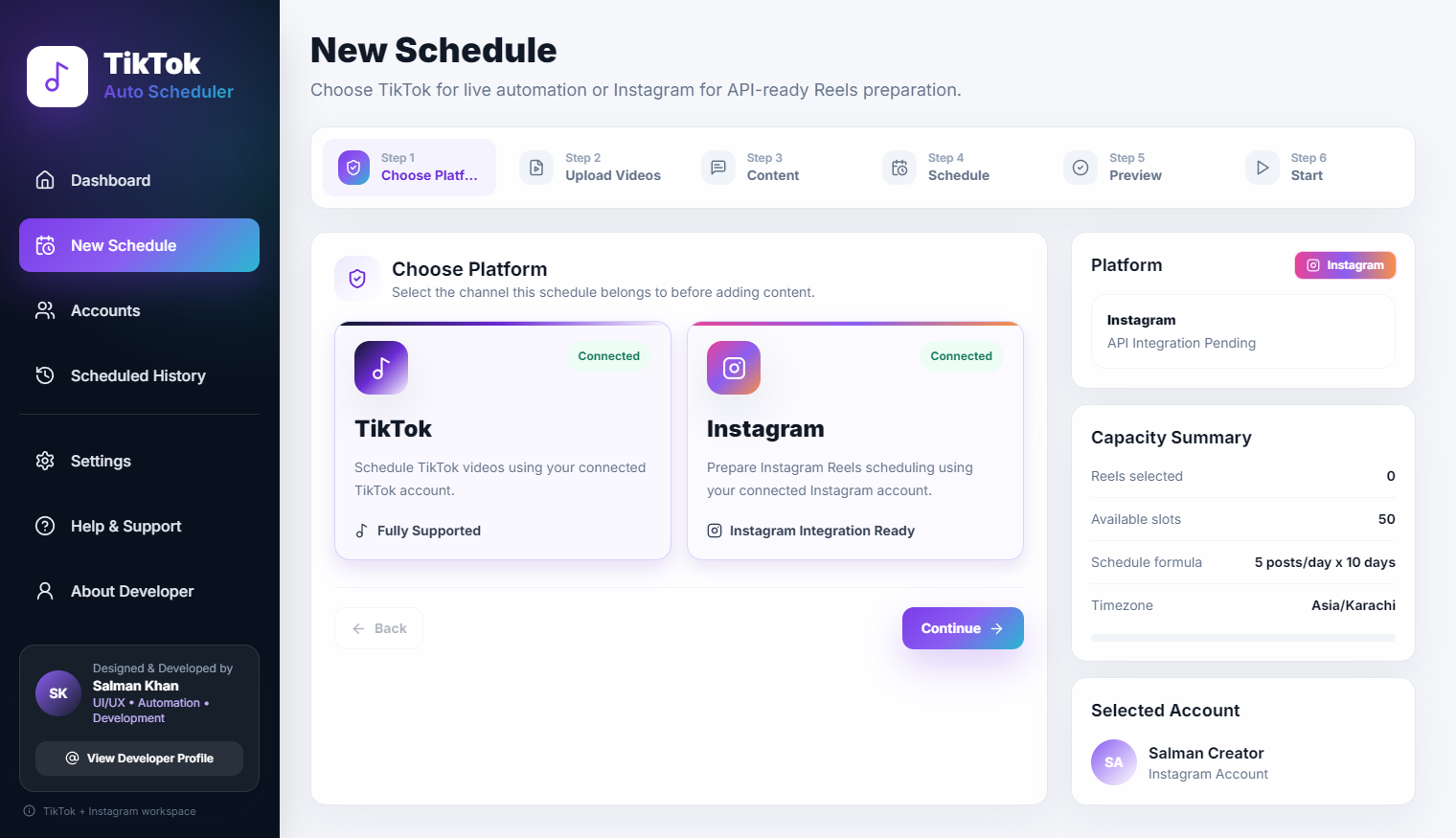
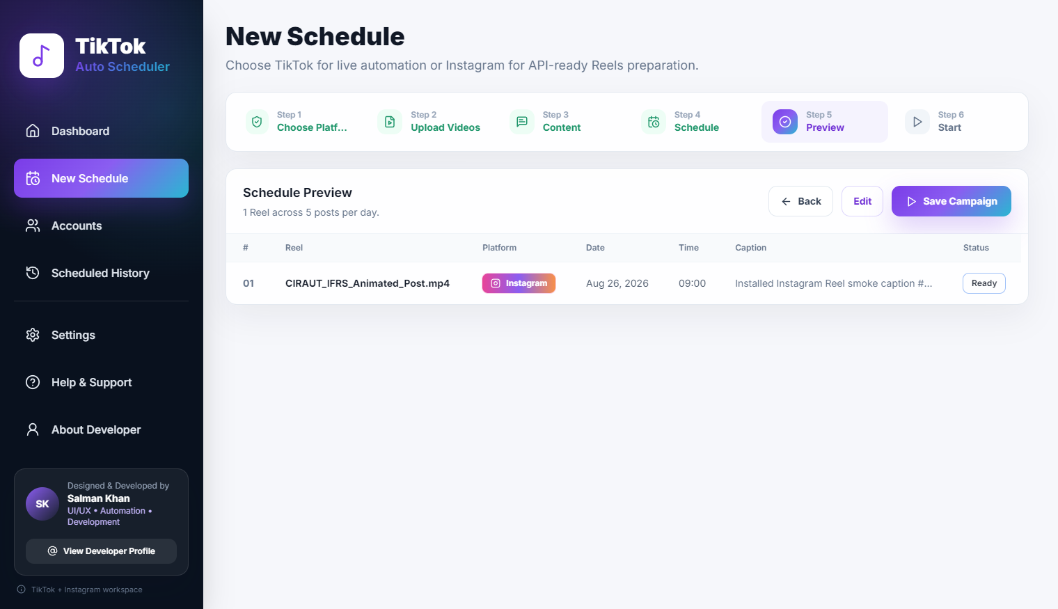
The UI should map directly to the mental model of the user's task. If the user thinks in terms of a 'Calendar', show them a calendar. If they think in terms of an 'Inbox' of raw assets, show them an inbox. Do not force the user to adapt to the database schema of the software.
Reduce Visual Noise
Automation dashboards often suffer from extreme clutter. Because the software is doing so many things, developers feel compelled to put a dial or a gauge for every single metric on the screen. This is a mistake.
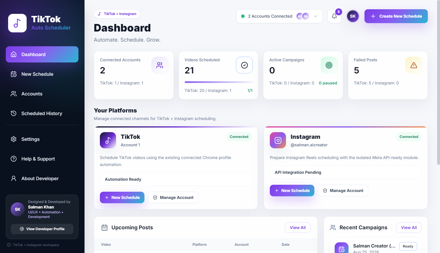
I employ a strict hierarchy of information. At a glance, the user should only see the macro status: Is the system running? Are there any critical errors? Detailed logs and deep configuration options should be progressively disclosed—hidden behind 'Advanced Settings' tabs or expandable log panels. Clean lines, dark backgrounds, and strategic use of negative space help focus the user's attention on what actually matters.
Show Status Clearly
The biggest anxiety users face with automation is the "black box" effect. They hit a button and then have no idea if the software is actually doing anything. To counter this, status visibility is the most critical element of the design.
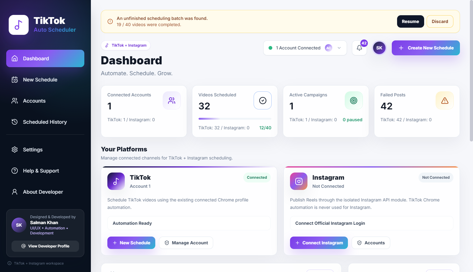
I use clear, unambiguous color coding: Green for success, Yellow for pending or retrying, Red for failure. But colors aren't enough. The software must actively communicate its current state: "Logging into account...", "Uploading asset (45%)...", "Verifying publication...". This continuous feedback loop builds immense trust.
Make Errors Understandable
Things will inevitably break. An API will change, a file will be corrupted, or an internet connection will drop. How the software handles these failures defines the user experience. Dumping a raw JSON stack trace onto the screen is unacceptable.
Errors must be intercepted, parsed, and translated into human-readable language. Instead of showing "Error 401: Unauthorized access", the UI should state: "The login session for Account X has expired. Please click here to re-authenticate." Furthermore, the UI should always offer a clear path to resolution or a way to easily retry the failed task.
Design Around Repeated Actions
Because these are tools designed for high-volume work, every click counts. If a user has to configure the same five settings every time they queue a video, the UI has failed. Defaults must be intelligent, and bulk actions are mandatory.
Features like 'Apply to All', 'Duplicate Task', and saving workflow templates are not nice-to-haves; they are core requirements. The interface should anticipate the repetitive nature of the job and eliminate as much friction as possible.
Test With Real Workflows
You cannot design good automation software in a vacuum. You have to watch someone try to use it to push 100 actual videos. Where do they hesitate? Where do they make mistakes? Which buttons are too small? Real-world friction points are rarely obvious during the initial wireframing phase.
Final Thoughts
Designing simple automation software is incredibly difficult precisely because the underlying mechanics are so complex. It requires relentless editing, a deep empathy for the operator, and a commitment to hiding the plumbing. When done correctly, the result is a tool that feels less like a complex machine and more like magic.